

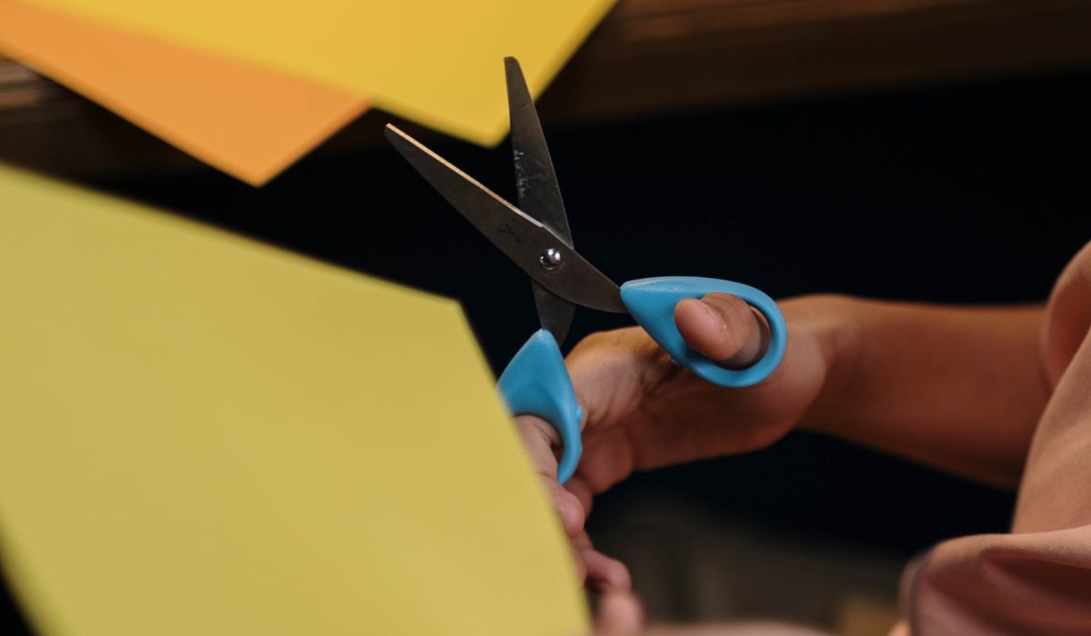
Start With the Right Tools
Hand lettering is far more forgiving than most people expect. You do not need beautiful handwriting to begin with — you need a flexible pen, paper that behaves, and a little patience. The pen does most of the work, and once you understand how it responds to pressure, letterforms start to look deliberate rather than accidental.
For beginners, a small-tip flexible brush pen is the easiest introduction. Look for a nib around 1–2mm: large enough to show contrast between thick and thin strokes, small enough to control. Dual-tip pens are excellent value because the fine end doubles as a detail tool. If you would rather use something you already own, a fine liner of 0.3–0.5mm and a pencil will take you a long way.
Paper matters more than most tutorials admit. A smooth 120–160gsm cartridge paper or hot-pressed watercolour paper keeps a brush tip sharp, while rough or heavily textured card frays it within a few letters. Always test a new pen on a scrap of your actual card before committing to the finished piece.
- Two or three brush pens in different colours, plus a black
- A 2H pencil and a soft eraser for guidelines
- A small ruler and a fine liner for details
- Scrap card in the same stock as your card blanks
Learn the Strokes Before the Letters
Hand lettering is drawing, not writing. That single shift in thinking unlocks everything else. Brush lettering works on one simple principle: thin upstrokes, thick downstrokes. When your hand moves upward, you lift the pressure so only the tip touches the paper. When it moves downward, you press and the nib splays to create a wide stroke.
Spend a week on drills rather than letters. Ten minutes a day is genuinely enough. Sit with both feet flat, keep your grip loose, and let your whole arm move rather than just your fingers — tight, cramped hands produce shaky strokes and aching wrists. Draw each drill slowly and repeat it until the rhythm feels natural.
- Overturn: a shallow arch, the backbone of letters like n and m
- Underturn: the mirrored curve, used in u and y
- Compound curve: an overturn flowing into an underturn, as in a
- Oval: the base shape for o, c and e
- Loop: the ascending and descending loops in l, g and j
Set Up Layout Guides
Nothing improves a homemade card faster than proper spacing. Draw your guidelines in pencil first and erase them only once the ink is completely dry. A 2H pencil leaves a faint line that lifts cleanly; a soft pencil will smudge and grey your card.
You need four lines: ascender, x-height, baseline and descender. A reliable proportion is to make the x-height roughly half the ascender height, which gives letters a friendly, readable weight. Add faint slant lines at a consistent angle — somewhere between 55 and 70 degrees from horizontal suits most modern styles — and your letters will sit together as a set rather than drifting apart.
To keep the whole card straight, tape the blank to a lightbox or hold it against a window, then slide a prepared guideline sheet underneath. Mark the centre point lightly so you can balance a short phrase, and always pencil your words in first at the size you intend them to be. Squeezing a four-word greeting into the space left for two is the most common beginner frustration.
Use Flourishes With Restraint
A flourish is simply an extended entry or exit stroke — the small curve that leads into a letter or trails out of it. Used well, it makes a card feel considered. Used everywhere, it makes the message hard to read. Choose one focal point per card: a swash on the capital letter of a name, or a long tail on the final word.
Balance is the trick. If you flourish the left side, echo it lightly on the right, even with something as small as a trailing curl. Keep flourishes away from the baseline where they would tangle with the letters below, and let them breathe into empty space rather than pushing into other words. Simple accents — a dot on the i shaped like a small heart, a crossbar with a gentle wave — often do more than an elaborate loop.
Faux Calligraphy for Everyday Pens
You can create the same thick-and-thin effect with any pen you own. Write your phrase in a fine liner, then go back and draw a second line just inside each downstroke, filling the gap in. This is called faux calligraphy, and it is a brilliant way to letter a card when your brush pen is dry or your confidence is low.
Work on one word at a time so the ink has time to settle. Keep the added thickness even — no more than two or three times the original stroke — and taper the ends slightly rather than leaving blunt shapes. Finished carefully, most recipients will not be able to tell which method you used.
Finishing the Card
Use a card blank of at least 300gsm so it stands upright and takes ink without cockling. A6 is a lovely size for a short message, and it uses a quarter of an A4 sheet, so you can make four cards from one piece of cardstock. Leave a comfortable margin of 15–20mm on all sides; cramped lettering looks anxious even when the strokes are perfect.
Let water-based ink dry for several minutes before closing the card — a folded card can transfer wet lettering onto the opposite panel. If you want a little extra polish, add a single ruled border in pencil or a tiny drawn sprig in the corner, then address the envelope in the same style so the whole thing feels like one piece.
- Keep greetings short: two to five words letters best
- Pencil, then ink, then erase — in that order, every time
- Sign your name in plain handwriting beneath the lettering
- Make two versions and keep the one you prefer
Practise on scrap card until the movements feel automatic, and remember that a slightly wobbly stroke made by hand carries more warmth than a perfectly uniform one. The small imperfections are what tell the recipient you made it yourself.



John Doe
14 January, 2022Having no content in post should have adverse..
Chauffina Carr
10 April, 2022We use these tests all time! Killer stuff!
Jim Séchen
16 July, 2022Thanks for all the comments, everyone!